CSS Battle: #11 - Eye of Sauron
In this article, I will solve a Eye of Sauron CSS Challenge on CSS Battle. Let's look at the problem first.
Problem
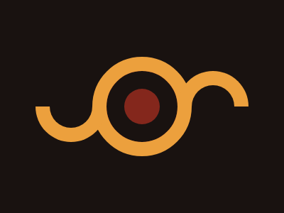
We need to create the following container by using CSS Properties only:
Solution
So now look at the Solution and how we are going to achieve this.
HTML
<p c>
<p l>
<p r>
<p c>: For Center Circle<p l>: For Left Semicircle<p r>: For Right Semicircle
CSS
Now let's style the containers.
body {
  margin: 0;
  background: #191210;
}
p {
  position: fixed;
}
[c] {
  width: 50;
  height: 50;
  background: #84271c;
  border-radius: 1in;
  border: 25px solid #191210;
  box-shadow: 0 0 0 20px #eca03d;
  left: 150;
  top: 84;
}
[l],[r] {
  width: 60;
  height: 30;
  border: 20px solid #eca03d;
  border-radius: 0 0 1in 1in;
  border-top: none;
}
[l] {
  left: 50;
  top: 134;
}

[r] {
  right: 50;
  bottom: 134;
  transform: scaleY(-1);
}Note: In CSS Battle you can use 100 instead of 100px. You don't need to define px in CSS. However, if you are using rem or %, you need to pass them separately. That's why in the above CSS code there are no units mostly. For more info visit here.
Minify the code or CSS by using any CSS Minifier. It helps you to reduce the characters in the code which will increase the score.
Minified Version:
<p c><p l><p r><style>body{margin:0;background:#191210}p{position:fixed}[c]{width:50;height:50;background:#84271C;border:25px solid #191210;border-radius:1in;box-shadow:0 0 0 20px #ECA03D;left:150;top:84}[l],[r]{width:60;height:30;border:20px solid #ECA03D;border-top:none;border-radius:0 0 1in 1in}[l]{left:50;top:134}[r]{right:50;bottom:134;transform:scaleY(-1)}Wrapping up
There are many ways to solve this. You can share your approach in the comments. If you like this then you can extend your support by Buying me a Coffee